Task reminder: Study the image for 25 seconds, then describe it in detail for up to 40 seconds. Use the 4-part structure: Intro → Trend → Detail → Conclusion.
1. Sample Image 1 Model Answer
This graph shows population growth in Canada from 1978 to 2009, broken down into total growth, natural increase, and net migration. Overall, migration became the dominant driver of population growth over the period, while the natural increase — the difference between births and deaths — gradually declined. A notable peak in total growth occurred around 1988 to 1990, after which growth fell before recovering steadily. By 2009, net migration accounted for the majority of Canada’s population increase, reflecting both declining birth rates and active immigration policy.
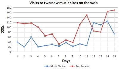
2. Sample Image 2 Model Answer
The line graph shows the daily visits received by two music websites — Music Choice and Pop Parade — over a 15-day period. At day one, Pop Parade had significantly higher traffic at approximately 120,000 visits, compared to Music Choice at around 40,000. Pop Parade’s visits declined steadily over the period, while Music Choice’s visits fluctuated but reached a peak of about 60,000 around day three before falling. By day 15, both websites had converged to similar visitor numbers. Overall, Pop Parade maintained a higher average daily visit count throughout the period, despite its declining trend.
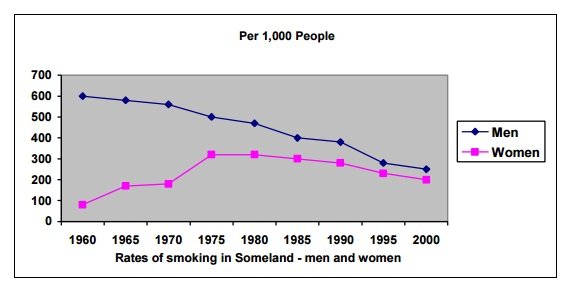
3. Sample Image 3 Model Answer
This graph compares smoking rates per 1,000 people for men and women in Someland between 1960 and 2000. In 1960, the smoking rate among men was very high at around 600 per 1,000, while the female rate was considerably lower at approximately 80 per 1,000. Over the 40-year period, male smoking rates declined steadily and significantly, reaching around 250 per 1,000 by 2000. Female rates, by contrast, initially increased — peaking at approximately 170 per 1,000 around 1975 — before declining to around 200 per 1,000 by 2000. While men smoked at higher rates throughout the period, the gender gap narrowed considerably.