Speaking › Describe Image
Exercise 3
Task reminder: Study the image for 25 seconds, then describe it in detail for up to 40 seconds. Use the 4-part structure: Intro → Trend → Detail → Conclusion.
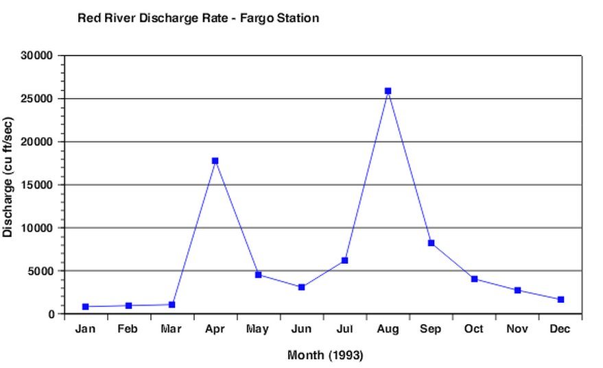
1. Sample Image 1
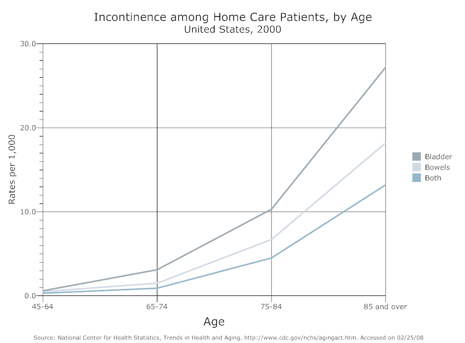
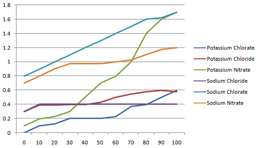
2. Sample Image 2 Model Answer 3. Sample Image 3 Model Answer PLEASE SHARE YOUR ANSWERS IN COMMENT SECTION FOR REMAINING IMAGES 4. Sample Image 4 5. Sample Image 5 6. Sample Image 6 7. Sample Image 7 8. Sample Image 8 9. Sample Image 9 10. Sample Image 10
Model Answer